


Brand strategy, visual identity and website design and build for Cambion Electronics, a precision components manufacturer.
Overview
From brand strategy to website launch
Cambion Electronics has spent decades making precision electro-mechanical and inductive components, but its brand hadn’t kept up. The identity was dated and assets were thin on the ground. The website, built in 2013, didn’t make it clear what Cambion did.
We took on the whole picture: brand strategy, a new visual identity, more than 300 re-rendered product images, a cleaned-up product data model and a new website built around how customers find parts. The result is one consistent brand, carried from the guidelines all the way through to every product page.
Shaping a cohesive brand strategy
A clear position in a crowded market
We started with competitor research, mapping how the rest of the industry was positioning itself: tone, visual style, product messaging, all of it. That gave us a clear read on where the market was crowded and where it wasn't.
We then used positioning matrices to plot Cambion against that landscape. This was the key step. It let us test and prove a actual white space Cambion could own, rather than guessing at a point of difference. The result is a position the business can hold with confidence: precise, understated and unmistakably its own.
From there we built the messaging framework. A brand proposition and value proposition capture what Cambion delivers, backed by defined archetypes, personality traits and a tone of voice that carries across everything the business writes.
A visual identity to last
Three routes, one identity
That strategy underpinned everything that came next. We translated it into three conceptual routes, each with its own design aesthetic. Every route came complete with logo treatments, colour palettes, typography, photographic styles, and mockups, so Cambion could see and feel the difference between them.
We refined the strongest route into a single identity that’s clean, precise and understated, built around a redesigned logo mark inspired by Cambion’s own connector pins. A richer brand blue keeps Cambion’s existing colour recognisable, set against a monotone palette, two clean typefaces and a bespoke grid that mirrors the structure and precision behind the products.
We documented it all in a 90-page set of brand guidelines covering everything from logo usage to tone of voice, then rolled it out across every marketing touchpoint, from social and print to large-format assets.
Every product image, reimagined
From blurry to photorealistic
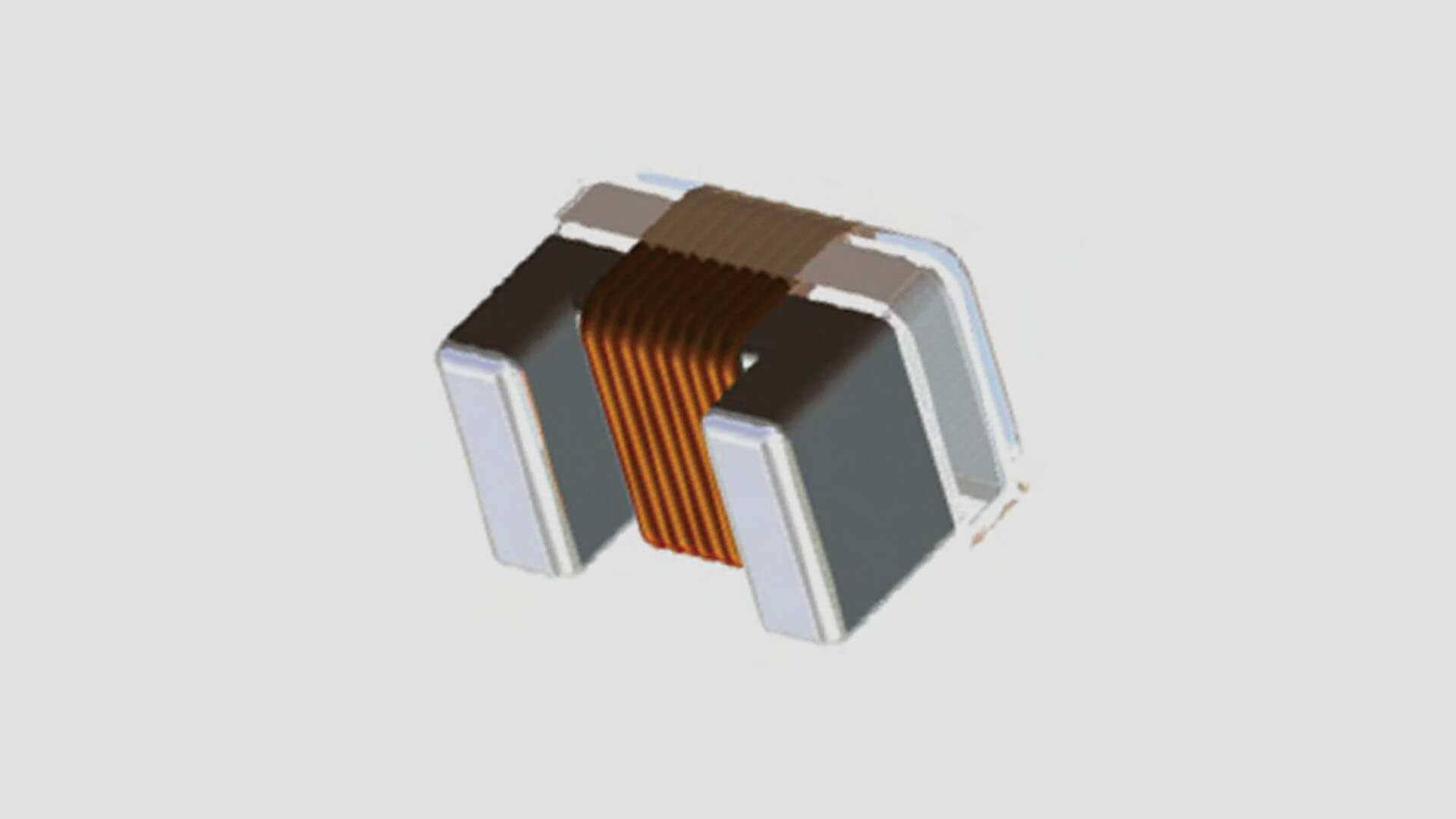
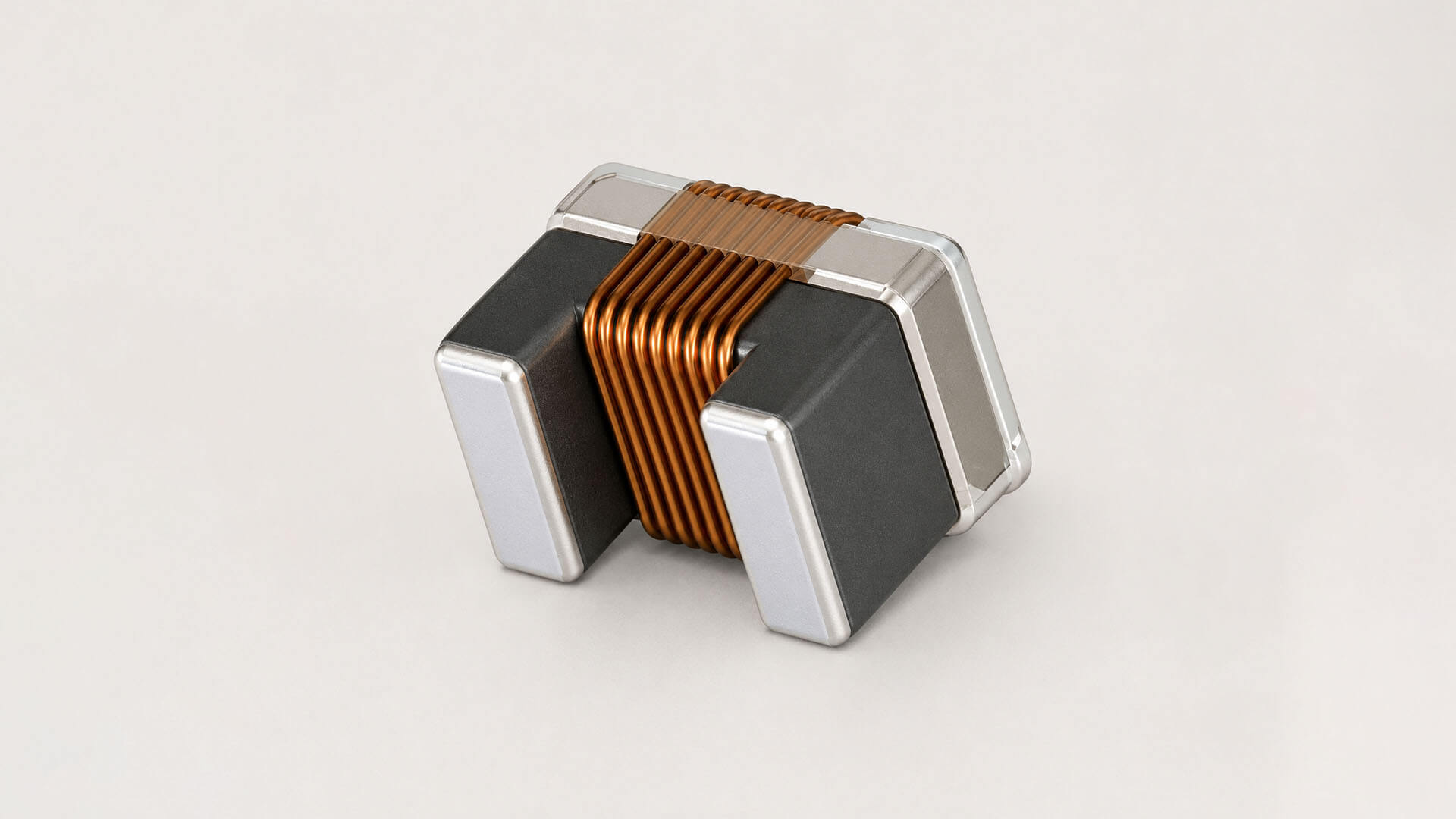
Cambion’s product catalogue was built from low-resolution CAD renders: accurate but flat, and a long way from the precision the parts are known for. We used AI to upscale and re-render more than 300 of them, tuned to the new brand right down to the background colours. The catalogue now looks as sharp as the engineering behind it.
Untangling the data
One clean source of truth for every product
Cambion’s product data had built up over decades. Around 2,000 base products and 8,000 to 10,000 variations sat across roughly 80 tables in a custom-built internal system. Part numbering rules, plating codes and colour codes only made sense to the people who’d worked with them for years. All the information was there, but nothing connected it.
Before we designed a single product page, we mapped that data end to end, then cleaned and restructured it into a model the new site could use.
Bringing the brand to life online
A website built around how engineers find parts
We started with the sitemap and rebuilt the structure around the reasons people visit: finding a part, downloading a datasheet, checking certifications and locating a distributor. Wireframes tested those journeys before any visual design began.
The design carries the new identity across every page. We built it as a library of reusable components and page blocks, so Cambion’s team can create and update pages themselves without breaking the brand.
The product catalogue is built to scale. Search and filters let customers narrow more than 8,000 part variations down by the specifications they need, and every product page puts technical details, datasheets and downloads in one place. Behind it, the same clean data feeds every page, so the site keeps up with Cambion’s internal systems.
Brand growth and beyond
Built for what comes next
The new brand’s first major outing was Electronica in Munich, where Cambion Electronics put its new identity in front of the global electronics industry.
Launch isn’t the end of the work. The next phase is the distributor portal, which gives distributors and direct customers a secure place to request quotes and track orders.
With a full set of brand guidelines, a library of on-brand product imagery and a website its own team can run, Cambion can keep growing without losing consistency.
Client
Cambion Electronics
Services
Brand Strategy, Branding, Digital Design, Development
Cambion Electronics designs and manufactures precision electro-mechanical and inductive components for aerospace, defence and professional electronics markets. With roots going back to the 1930s and accreditations including ISO 9001 and EN 9100, it’s a business built on getting the details right. Cambion is part of a group headquartered in Singapore and sells both direct and through a worldwide network of distributors.