
AgencyResources
Let's stop pretending we can skip project discovery phases
Read articleWe’ve seen it happen too many times. You’ve invested in a new app or website for your business. Then six months in, your budget has been blown.


Written by Sam Leonard-Rendell, Lead Designer
In an ever-changing digital world, the last thing you want to do is stand still if you're looking to stand out. Your website might be the first impression for visitors to learn about what it is your business does and we know how much weight negative experiences hold, whether it's an accurate representation of your services or not. That's why making UX and UI improvements to refine your website, rather than simply launching it and moving on, is an invaluable practice.
Take the opportunity to show users that you care about their experience as much as you care about presenting yourself in the best light. A killer way to do that is through iterative design.
It might seem counterintuitive, but there's a crucial difference between improving your website and fixing it: the latter meaning you’re making it better without it first being broken. You're ahead of your game rather than trying to catch up. In other words, you're in control of what you're changing, why you're changing it, and how you're going to do it – and that is an exciting place to be.
With digital environments constantly shifting, adaption shouldn't be a knee-jerk reaction. Using iterative UX and UI improvements, it becomes a steady evolution over time based on user testing, feedback and research from platforms like Hotjar, Google Analytics and Microsoft Clarity. This means that you're not just addressing changes as and when your business grows, but focusing heavily on what users want most from your site and responding to it in good time.
Our work with Wightlink is a fantastic example of how iteratively updating websites based on user feedback improves performance and overall experience for visitors in the same breath. First, we successfully redesigned a user-centric website built around how ferry passengers actually plan and travel. Where holidaymakers look for reassurance and clarity, regular commuters need speed and efficiency, so it was important to consider the individual requirements from each group as well.

Then, by working closely with Wightlink, we uncovered persisting pain points and the solutions needed to fix them, resulting in the addition of Best Fare Finder and Wightlink Explorer post-launch. Read the full case study here to learn how our research shaped three core design principles that made all the difference.
Our research into Wightlink and their user groups gave us exactly what we needed to make informed decisions around what the user needed most.
Andy Mardell – Technical Account Manager
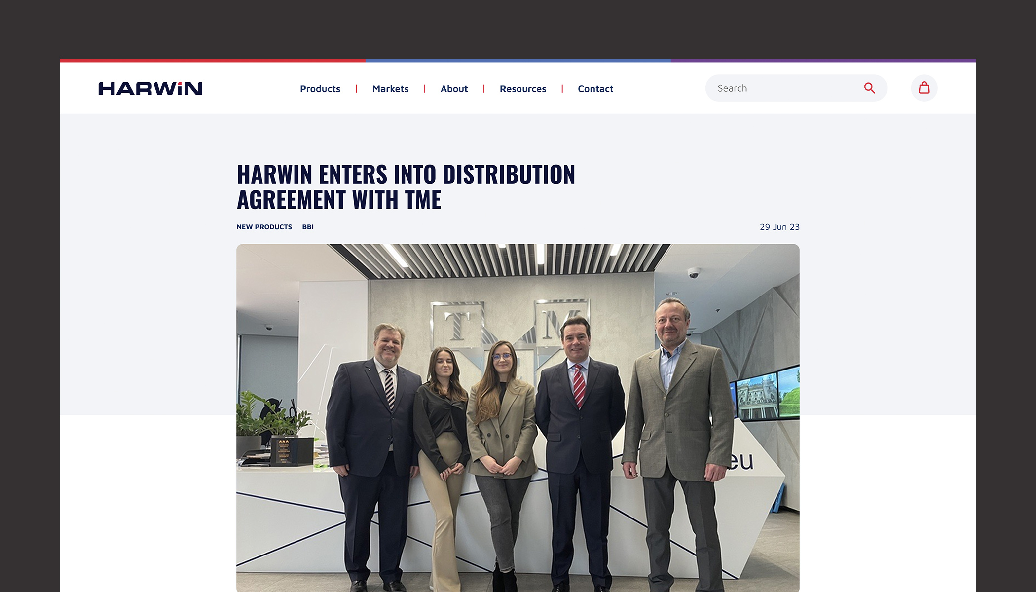
On top of overall user experience, iteratively updating your website means you can also make processes more efficient. When we rebuilt leading connector company Harwin's website from the ground up, we brought together their Salesforce system for product data with Bynder for digital assets, supported by a Payload CMS for content management, all through our secure Faraday middleware. It's not only made operations smoother, but more adaptable too. For example, switching out different tools based on changing business needs, and automatic syncing of new products to ensure everything is always up to date on the site.
We also continue to launch new updates as and when they're needed for Harwin, including the helpful Cable Configurator – a user-focused experience for specifying bespoke products for customers’ projects. Plus, by using Microsoft Clarity session recordings, we've made significant UX improvements to a whole host of features, such as a clearer navigation bar, better drop-down menus, improved type hierarchy, a more user-friendly contact page, a clearer layout for complex data on product pages, and plenty more.
And see how we slashed website load times by 90% for Harwin here.
Harwin's navigation bar before and after UX & UI improvements
Cohesion is key when it comes to having a recognisable business. As it grows, it's inevitable that your brand look and feel might change with it, so clear alignment is crucial to instill both trust and confidence in your customers. Plus, by updating iteratively in-step with competitors' sites and user feedback, it doesn’t have to be a huge overhaul – small changes are just as effective as the big ones.
We mentioned at the start of this article that the last thing you should do is stand still as the digital world continues to move forward – that applies to us as well. Besides regularly improving our own site, we have a proactive approach when it comes to our clients' needs. Rather than waiting for them to discover a pain point or issue that needs addressing, we're already thinking about what solutions would work best for them next.
As long-term partners, our clients know we have their interests in mind and trust that we'll bring something to the table that doesn't just solve a problem, it's already part of a larger iterative approach strategised to improve their product.
Totally free, no strings attached, we promise.
Looking for someone to help tackle your problems with creative solutions? Drop us a line. We're always keen to chat.
Published on 03 March 2026, last updated on 24 March 2026.
Have a read of some of our other articles
We’ve seen it happen too many times. You’ve invested in a new app or website for your business. Then six months in, your budget has been blown.

Check out our 10 Usability Heuristics Posters and download them to print and put up in your workplace.